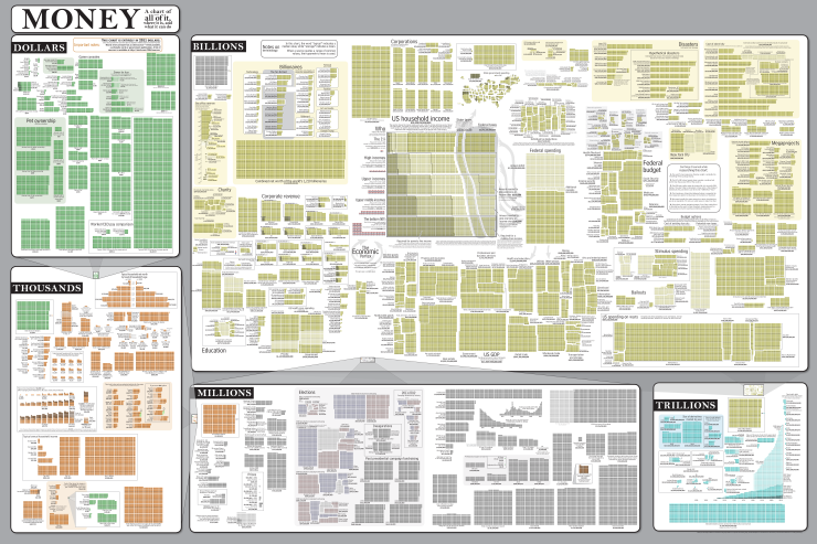
A colleague at work sent me this visual representation of what could be described as 'the cost of everything', an attempt to document the amount of US Dollars spent, on average, on items ranging from the humble apple to the entire nation's spending on wars.
It's hard to be sure just how accurate it is (although a list of government sources is given), and no little amount of time needs to be dedicated to fully comprehending such a vast wealth of information (I'd suggest starting at the top left), but it is an astonishing, if rather saddening, picture of where the money is spent in our western society and the gross inequality prevalent therein.
Compare the average worker's annual salary with the disproportionately large figures of the leading CEO's and it's hard not to immediately rush for the red flag whilst frantically belting out the words to the Internationale!
Source: http://xkcd.com
It's hard to be sure just how accurate it is (although a list of government sources is given), and no little amount of time needs to be dedicated to fully comprehending such a vast wealth of information (I'd suggest starting at the top left), but it is an astonishing, if rather saddening, picture of where the money is spent in our western society and the gross inequality prevalent therein.
Compare the average worker's annual salary with the disproportionately large figures of the leading CEO's and it's hard not to immediately rush for the red flag whilst frantically belting out the words to the Internationale!
 |
| Click here to enlarge |